Pavlina Popovska / E+ via Getty Images
Editor's note: The following text is a transcript of a podcast story. To listen to the story, click on the arrow beneath the headline above.
MYRNA BROWN, HOST: Today is Tuesday, October 21st.
Thank you for turning to WORLD Radio to help start your day.
Good morning. I’m Myrna Brown.
MARY REICHARD, HOST: And I’m Mary Reichard.
Coming next on The World and Everything in It: A design trend you may have noticed in the baby aisle at Target or on your social media feeds, .especially if you're a new mom.
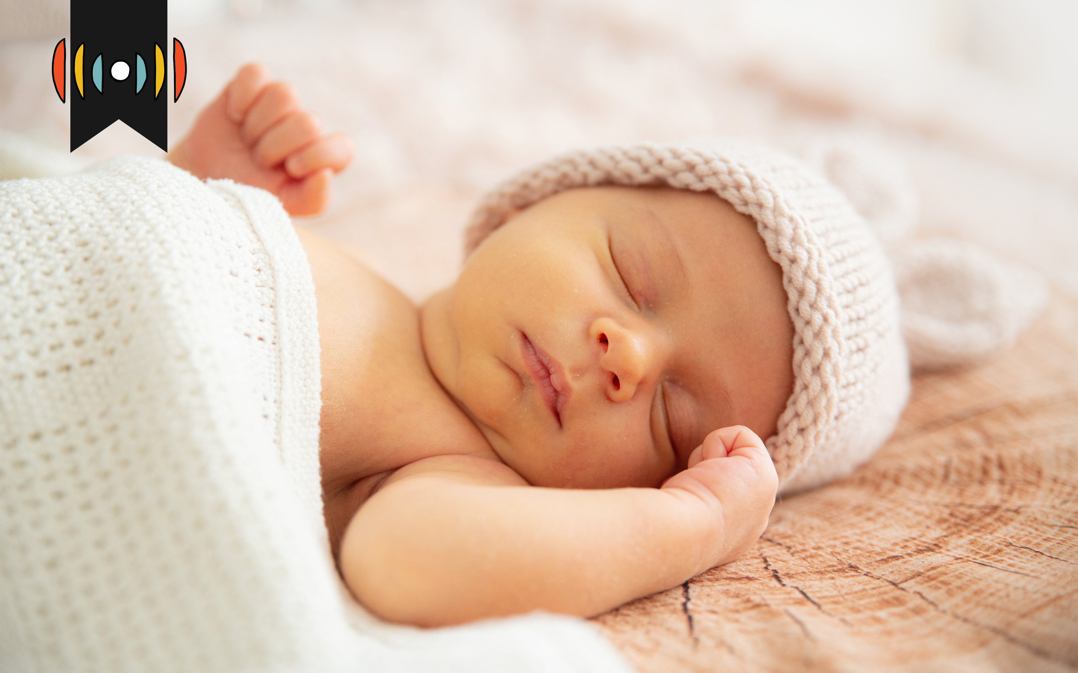
BROWN: Forget the bright reds and yellows that once filled baby nurseries. Today’s kid gear looks more like a minimalist living room. Online ads and media influencer posts awash in shades of beige.
So what’s behind the muted trend? Here’s WORLD’s Kristen Flavin.
SOUND: [Camera clicking, baby noises]
KRISTEN FLAVIN: Andria Fontenot crouches to photograph a smiling 15-month-old girl gripping the railing of her crib.
SOUND: [Camera clicking, baby noises]
Fontenot has been a photographer for 20 years and specializes in newborns. She’s seen a big shift in what parents want.
FONTENOT When I first started with newborns, there were a lot of props and a lot of themes. People are definitely leaning towards the more muted style. I did keep some of my props that have more colors in them, like some of my blankets and swaddles, but I haven't been bringing those out as much…
WORLD feature reporter Addie Offereins joined Fontenot at today’s photoshoot in Lynchburg, Virginia. She said this nursery isn’t all beige, but it reflects the trend: a preference for soft colors, simple decor, natural fabrics.
Fonenot wonders if photographers themselves could be driving the look.
FONTENOT: They end up influencing the trends, because they're like, honing in on, like, one aesthetic. But I think too, like, parents these days are being more mindful about, like, what's in what's in the environment, and, like, choosing to go the more organic and safer route with what they're putting on their baby and what they're putting in the environment.
Photographer Liz Cook agrees. She believes a growing interest in health and wellness could be playing into the preference for fewer dyes and plastics. She also wonders if our increasingly visual world is playing a role.
COOK: People are just photographing every part of their lives. I have actually seen hospitals renovating the birth areas to make it more aesthetic, to draw in mothers because they want to bring in birth photographers. And so I think a lot of what we're seeing is also just aesthetic, and it's just easy on the eyes.
Critics of what has been dubbed the “sad beige” trend argue it’s stripping color and life from spaces that should be filled with bright patterns and a little bit of chaos.
The trend has inspired some influencers to parody the trend in videos on TikTok and Instagram—like this one making fun of an online website for children’s clothing:
AUDIO: I call this the gingham shroud of seasonal depression, perfect for staying into the abyss and pondering your own mortality.
And it has some pediatricians and psychologists uncomfortable as well. Their concern: Are children missing out on essential stimulation?
Babies are initially drawn to high contrast colors and patterns. Like black and white stripes and shapes. By three to four months, babies start responding to primary colors.
AUDIO: Yellow….When yellow sneaks into my day I race outside to jump and play.
The classic Baby Einstein videos feature a succession of primary colored shapes, puppets, and images from nature.
Trendy American mothers obsessed with beige may limit this stimulation at home. Many experts say it won’t harm babies in the long run. They say it’s hard to escape color in the world and even ceiling fans can provide babies with interesting contrast.
But applied environmental psychologist Sally Augustin doesn’t like the trend and she’s been keeping an eye on the rise of beige.
AUGUSTIN: People have a tendency to think that, you know, the absence of color is the fallback that they should use. I think that's really a waste, because color is one of the aspects of your environment that you can put to work for yourself. When you don't add color to your children's rooms, you miss the opportunity to use a tool that can help them experience life
She said that doesn’t mean parents have to reach for super bright colors that might clash with the rest of the home or stress them out.
AUGUSTIN: Colors that are less saturated and light, you know, say very light, smoky blue or very light, you know, very, very light, Sage green. Well, those colors are relaxing to look at, and, you know, they're great for children's rooms, for the walls and things like that. For the parents’ state if nothing else.
Trends in the material objects we associate with babies and children usually reveal something about American society as a whole.
DANIEL COOK: The children's clothing industry really sort of took off as an industry, you know, in the mid 1910s right just before World War 1.
Daniel Cook is a professor of childhood studies at Rutgers University. He believes it's important to keep a historical perspective in mind.
COOK: In terms of colors, they stayed rather muted, generally for children's clothes, particularly because of the the lingering sense all the way into the 20s and 30s, and, you know, probably up to post post World War 2 that there would be too much attention placed on the child themselves, that they would become a little too self absorbed.
Cook noted that the market for brightly colored children’s toys and clothing really took off during the 1970 and 80s especially once the idea of the teenager entered American culture.
COOK: A concern that children are growing up too fast, too soon. Sometimes it was the media, because it was starting to be all different kinds of TV shows. Part of the reaction to that was a whole segment that sort of made these sort of incredibly primary color-ish kind of child clothing….
Today, soft colors seem to be more about aesthetics and the influence of what parents see online.
Back in the nursery, Andria Fontenot is wrapping up her photoshoot.
SOUND: [Photoshoot]
Design trends aside, Fontenot said that part of her goal is to remind moms to find beauty in the small moments of the newborn stage, regardless of the color and chaos of their surroundings.
FONTENOT: My favorite thing is just being able to, like, capture that and document that love that you have for your family, and it's just really special.
For WORLD, with reporting from Addie Offereins, I’m Kristen Flavin.
WORLD Radio transcripts are created on a rush deadline. This text may not be in its final form and may be updated or revised in the future. Accuracy and availability may vary. The authoritative record of WORLD Radio programming is the audio record.
Please wait while we load the latest comments...
Comments
Please register, subscribe, or log in to comment on this article.